Remember that moment when you moved into your first apartment? That moment when you’re proudly celebrating your milestone into adulthood, only for it to come crashing into the reality of how much work it actually takes to transform a stark apartment into the cozy haven that serves as your personal sanctuary.
house2Home is attempting to make the experience of styling homes easier for new apartment renters. They’ve hired me to run a five-day design sprint to come up with solutions to help a previously under-represented market of new renters.
Improve the shopping experience for first-time apartment renters looking to decorate their place
Run a five-day design sprint following Google Ventures methodology
Create solutions for the desktop version of the client’s website
Solo design sprint as UX/UI Designer
Two website features that are ready for development and one feature that is recommended for further research
Ability for new apartment renters to shop with less cognitive overload, more confidence in style execution, and more adherence to budget constraints
Project Steps
objective
The goal for Day 1 was to familiarize myself with the problem space - the who, the what, and the why.
problem
The target user was a first-time apartment renter who was looking to furnish their place with home decor.
Pain Points
Users found it hard to style apartment while staying within budget
Too many product offerings made the shopping experience time-consuming and overwhelming
Users couldn't visualize decor in their actual apartment space
Users didn't know how to translate online inspirations into reality
business impact
Because of these pain points, users felt overwhelmed during the shopping process and would often end their shopping experience without purchasing. This affected the store’s conversion rates and affected their bottom line.
If we can solve these frustrations, house2HOME can capture this underserved user group and generate more revenue.
Day 2’s purpose was to brainstorm for possible solutions quickly. While I looked towards competitors within the same industry for inspiration, I also looked at a tangential competitor from another industry. I did so to broaden my imagination and learn from concepts that abstracted away industry limitations. Ideation was done on paper to maximize speed.
crazy 8’s
objective
Now that I had some solution ideas, it was time to narrow down on the best ones to keep developing. I chose the best solutions that:
solved for the users’ pain points
worked within the client’s constraints
were technically feasible
Since I would only have one day to develop the screens I needed for testing, creating rough sketches for a storyboard helped me prioritize and visualize the most important screens. Effectively, it acted as a low-fidelity wireframe.
objective
In order to test the solution concepts with users, it was necessary to create a functioning prototype that could mock what the shopping experience would be like. Due to the tight time constraints, branding and styling of screens were of minimal concern as long as screens did not distract the users from the tasks.
solutions
Augmented-Reality powered virtual room simulator
Using photos of their real space, user would feed the information into the room generator and a virtual rendition of their apartment space would generate. Users can place decor items and move them around.
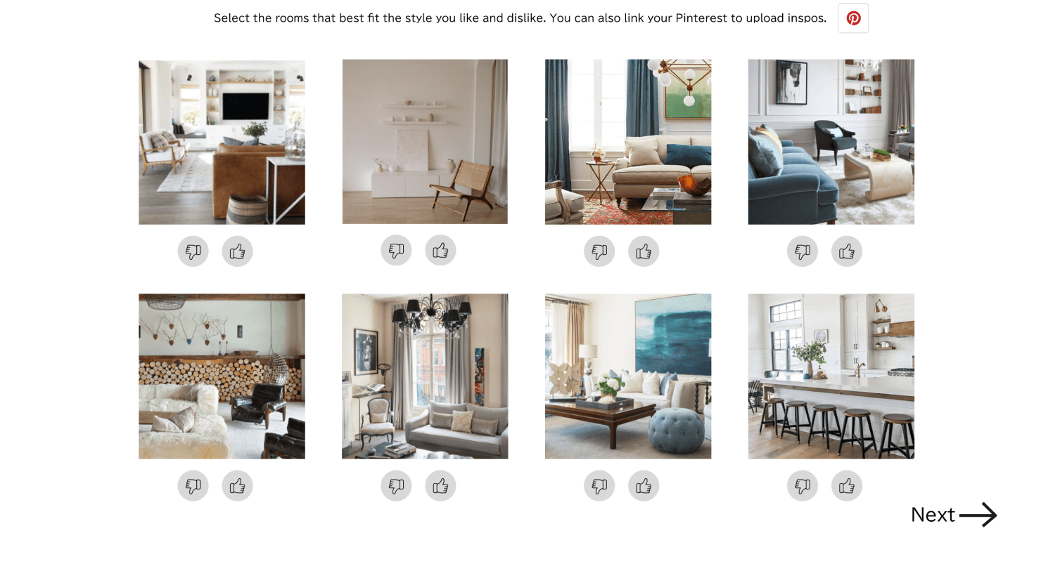
Customization Quiz
Users fill out a quiz that asks about style preferences and budget. Using that information, a curated set of decor items would be recommended and placed in the room simulator. Users can add or augment the starter set of decor items.
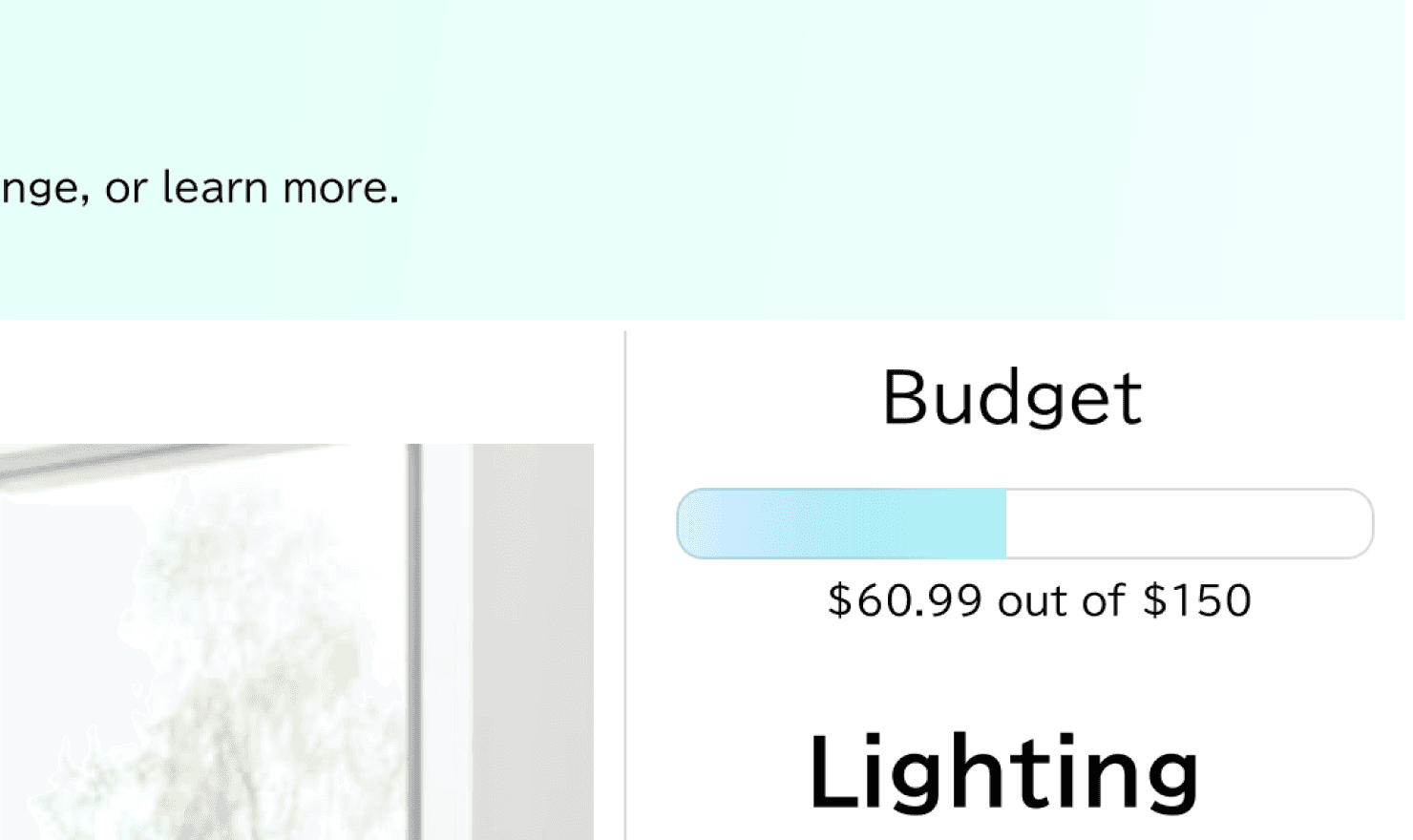
Budget Tracker
A progress bar - styled tracker would appear on the virtual room simulation page for users to clearly see how much their decor items cost where the costs are in relation to their total budget. Adding or subtracting items would dynamically be reflected in the budget bar.
objective
Predicting whether a design feature will be used by users boils down to discoverability and understanding. If users saw the features and understood their purposes, they could decide to utilize it during their shopping experience.
The main questions we wanted to answer were:
Do users understand the virtual room simulator and are they able to see the decor items in their actual space?
Do users understand that the style quiz will guide customization of recommended decor items?
Are users able to monitor their budget and spending as they shop?
results
Highlights
of users understood the virtual room tool’s purpose
of users saw and understood the budget tracker’s purpose
of users understood that the style quiz’s purpose
summary
Augmented Reality-powered room simulator
Adds massive benefit to the user’s experience because it solves for the visualization issue
More technically advanced and will take more time and resources to build
Customization Quiz
Easy to create and implement
Decreases overwhelm and time spent shopping by hiding irrelevant products
Helps users stay within budget by filtering out items that are too expensive
Low risk design - frequently used in many products
Budget Tracker
Easy to create and implement
Helps users easily stay informed on their prospective spending before moving to checkout page
Low risk design - frequently used in many products
next steps
Implement budget tracker
Implement customization quiz
Conduct more research (cost-benefit analysis, additional ideation sprints, etc) if stakeholder buy-in is needed, or create a project to implement the AR room simulator


