Role
Team lead, UX Researcher, UI Designer
Industry
Tech (SAAS)
Duration
4 weeks, Oct-Nov 2023
Device
Desktop
Boardspace
User-Centered Approach to Document Management
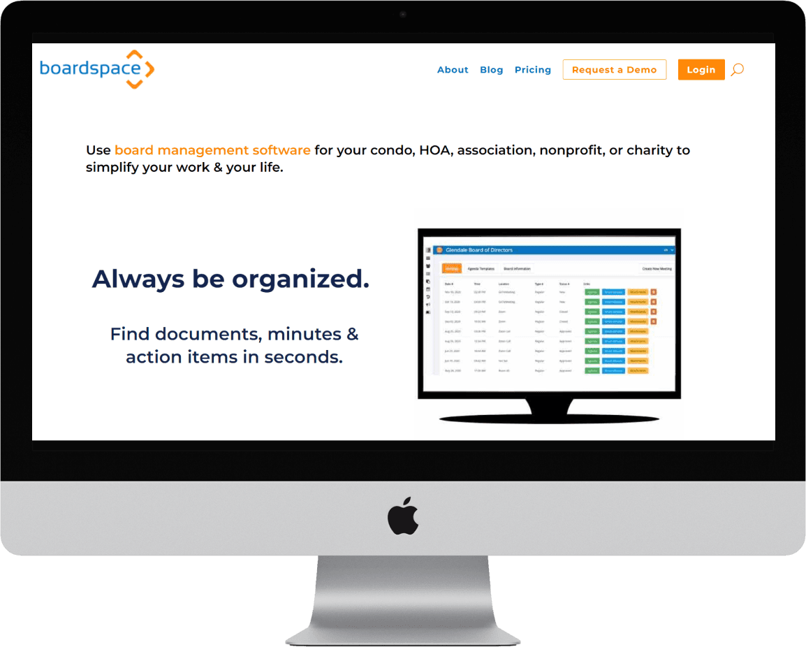
Boardspace is a one-stop SAAS online platform intended to help volunteer board members meet their administrative needs with conducting board meetings
Boardspace is looking to improve their document management feature to be more user-friendly and modern-looking
Project Overview
Problem Space
Users find that the current UI for documents management is unintuitive, and they often require training or help from Customer Service when first learning the system
Challenge
Improve designs for documents management to be more user-friendly and intuitive, lower the learning curve for new users, and increase overall user satisfaction
Digital Tools
Figma, G Suite (Forms, Sheets, Docs), Figjam
My Roles
Team Lead: Project plan, external communication, meeting organizer, test coordinator
UX Researcher: Research plan, Usability testing, data analysis
UI Designer: Ideation, wireframes, high-fidelity prototypes, interaction design
Project Scope
Conduct usability testing with new users
Create high-fidelity prototype
Validate designs with usability testing
Kristin
Design Lead
Jessica
Team Lead
Logan
Research Lead
Working Style
Collaborated extensively in all project phases under a designated lead for each phase who owned decision-making and focus in that realm
Target User
50-80 years old
Varying levels of technical ability
Volunteer board member (typically for NGO's, condo co-ops)
Constraints
Existing brand palette and font family
No changes requiring significant infrastructure scaling or changes
Working within the Documents tab of the main menu
Strict timeline of four weeks
Project Summary
Discovery & Test
How intuitive are the current experiences of the document management features?
How does the product compare to its competitors?
What are the most significant pain points?

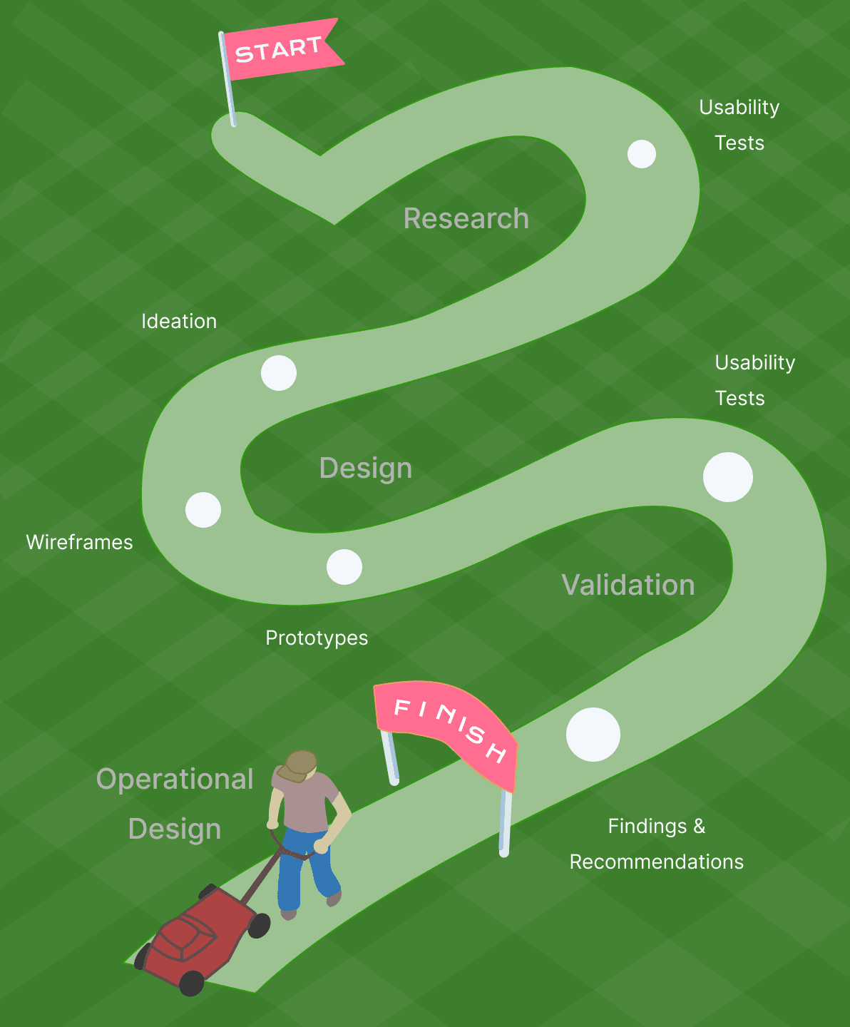
I created a project plan that would guide the team to explore the problem space, ideate possible solutions, design a mockup of our recommendations, and validate the success of our designs
The project is split into four phases:
Discovery Phase: Learn about the product and plan the project's process
Test Phase: Perform usability tests to identify biggest pain points
Design Phase: Ideate possible solutions and create a working prototype
Validate Phase: Test the designs for usability and likeability
Usability testing identified frustrations with four key features:
Uploading documents
Linking existing documents to board meetings
Managing tags
Searching for documents

Design Solutions
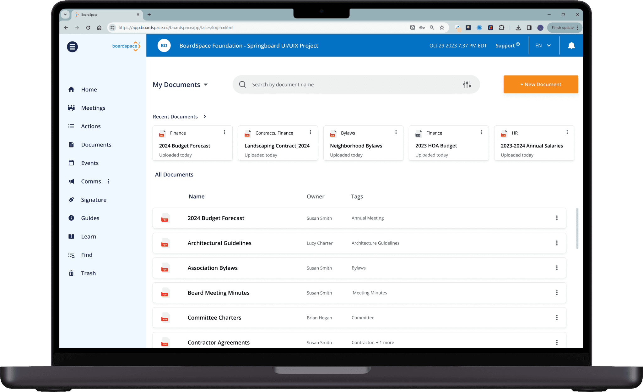
Visual Layout Update
The new Documents page's modern-looking interface features a prominent search bar, visual balance across the page, and enhanced user feedback for actions
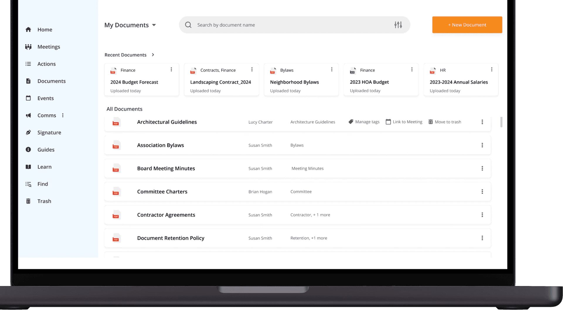
Hover Menu for Document Actions
Icon and text menu appears on hover next to each file for easy tag management and meeting link capabilities
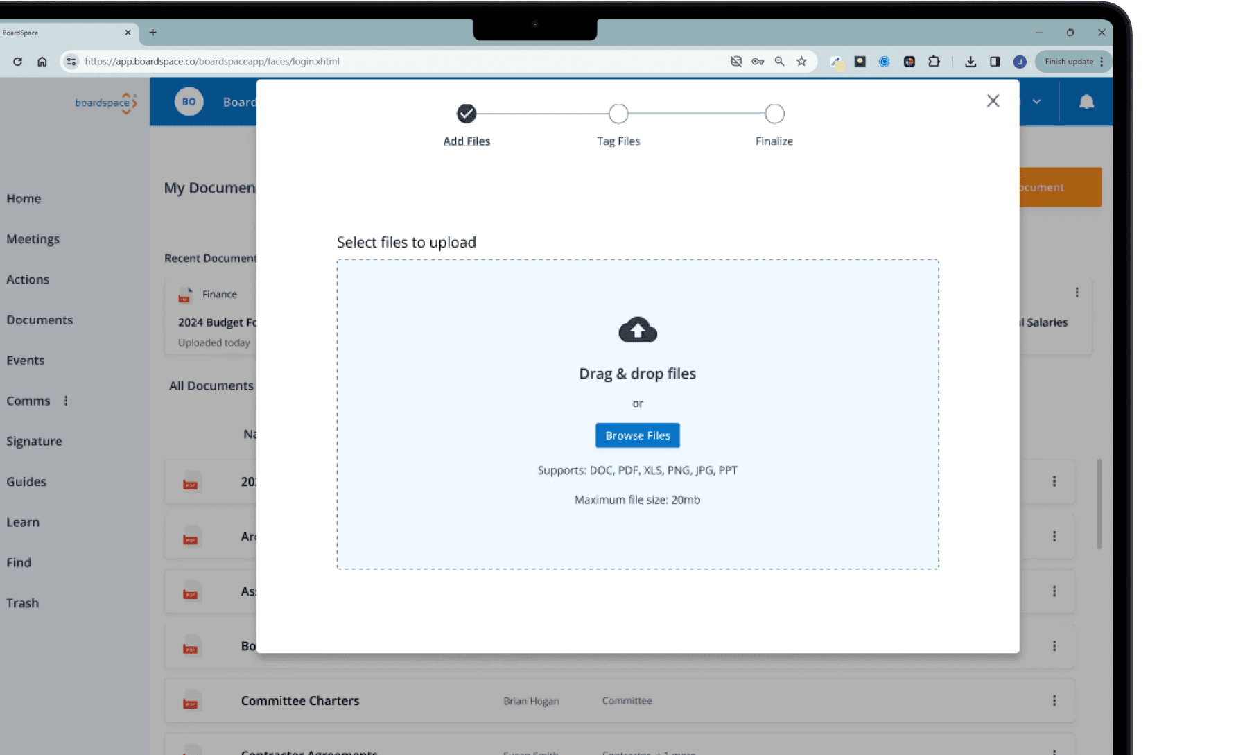
Upload Flow in Overlay Window
Clicking the Upload CTA button opens up an overlay window that walks user, step-by-step, through the upload process to simplify and clarify the multi-step process
Continue reading for full case study
Discovery Phase
Project Design
My Role
Team Lead

My Deliverables
Project Plan | Research Plan
As the team lead, my goals were to avoid scope creep, make deadlines for key deliverables, and deliver useful insights that come from testing. To accomplish those things, I implemented some project planning activities to guide our team towards success. Here are some of the actions I took:
Created a project plan that mapped out our activities and schedule, giving us a clear step-by-step action plan to follow
Organized the notes from our meetings on a shared Figjam whiteboard, which kept track of our discussions, dates of upcoming assignments and action items for each person. Figjam was also our centralized repository of our work within this project, so throughout the project, it was easy to go back and reference material from past sessions
Handled communication with external stakeholders and submitted official key deliverables on behalf of the team. I set up testing session, sent weekly agendas to the client, and conveyed our process with our supervisor
Delegated the design and testing lead roles to my teammates based on their individual strengths and acted as support for them in every stage of the project

Project plan showing work breakdown and deadlines for each activity
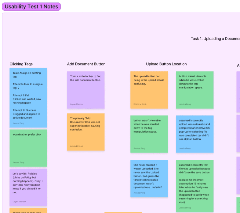
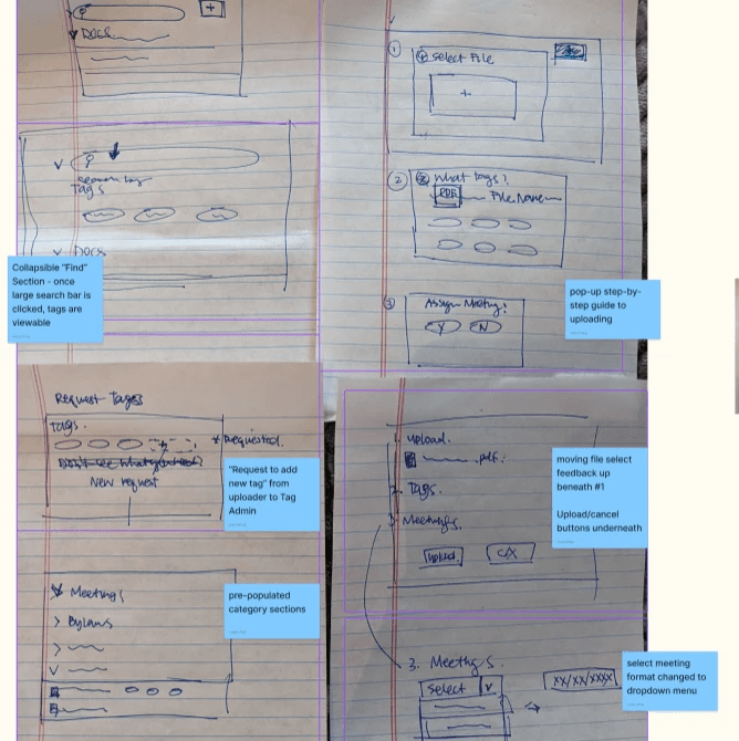
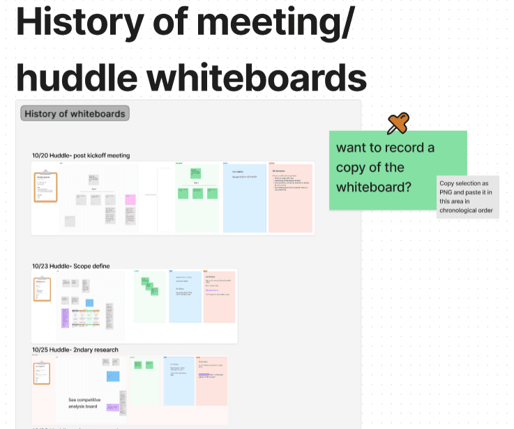
Exerpts of the Figjam board with shared notes, previous activities, meeting records. Pictured in clockwise from top left: affinity mapping on sticky notes, my ideation sketches with the team's comments, historical record of every huddle topic board
Learning About the Product
My Role
UI Designer/ UX Designer

My Deliverables
Heuristic Analysis | Competitive Analysis
To guide idea generation, my team and I analyzed six competitors—five direct competitors and one indirect competitor—examining industry standards to inform our approach. Using our findings, we had a conversation around solution possibilities, such as AI capabilities and expanded search functions. The client helped us have a clearer understanding on what was a feasible option based on business constraints, so we could explore the product having those constraints in mind.
It was now time to examine our client's product. I walked through the entire product beyond our scope's page to gain a holistic understanding of features and capabilities offered. During this, I observed UI inconsistencies, like misaligned text and skewed icons. To address these issues with the client, I conducted a quick heuristic analysis and documented the findings, before turning my attention to focus on the Documents page.
While navigating the Document's page, my team and I tested its functions and collaboratively developed four user flows for this page.
Four Essential User Flows on the Document Page
1
Uploading new documents
2
Linking meetings to documents
3
Managing Tags
4
Searching for documents
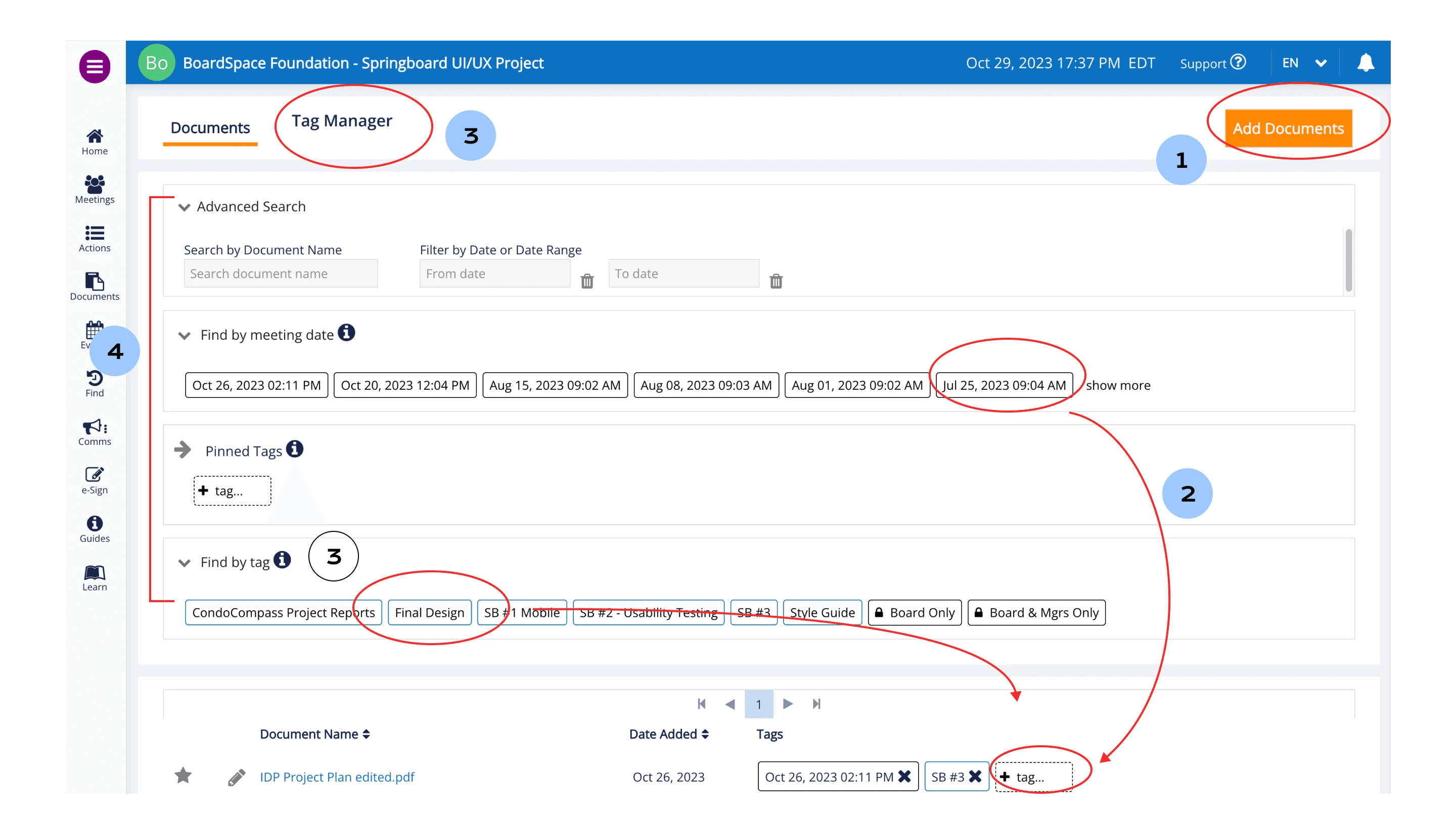
User flows on the baseline design
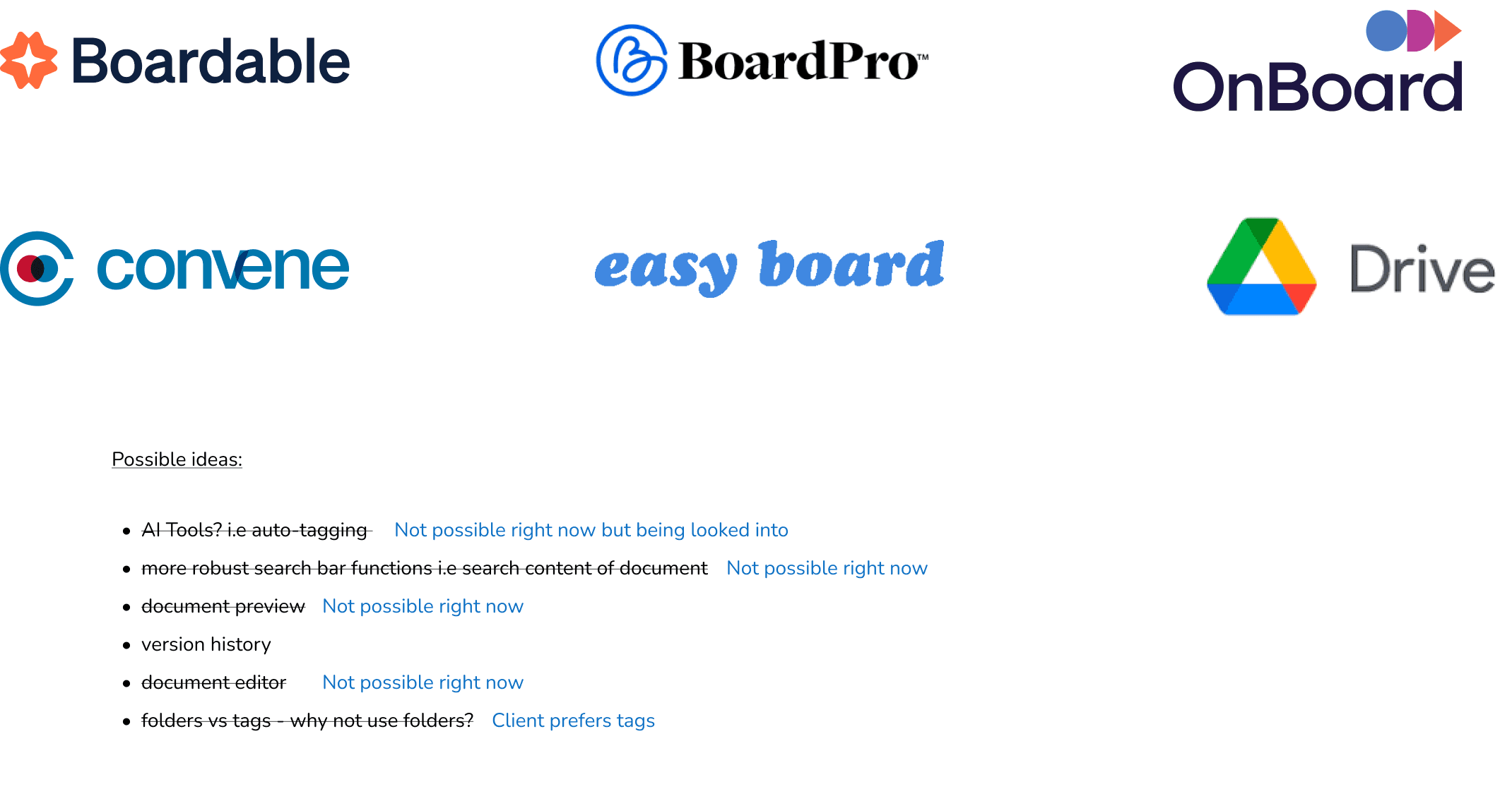
Competitive Analysis topics discussed
Test Phase
Usability Test #1
My Role
UX Researcher

My Deliverables
Two usability tests | Affinity Mapping
My team and I enlisted four participants who were new to Boardspace to observe an unbiased first-time experience. We asked our participants to carry out tasks that made up the four user flows and assigned a numerical value to their results.* We aimed to gain insights into their current habits and behaviors, so we inquired about their methods for sorting and searching documents. Then, as a team, we gathered to consolidate our individual test results and structure our findings around the identified four user flows.
*Each task per participant was given 0 points if it was failed, incomplete, or if the participant gave up. 0.5 points was given if it was successful, but with some difficulty. 1 point was given if it was a relatively easy successful task. The points per task were averaged and given a percentage.
Test Results Highlights
1
Uploading new documents: 63% Success rate
CTA button was hard to find
Not enough user feedback to inform users of action success
Location of Upload button in final step wasn’t visible and required scrolling to see
2
Linking meetings to documents: 50% success rate
Dragging tags instead of clicking was non-intuitive and required more dexterity than clicking
3
Managing Tags: 87% success rate
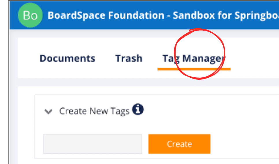
Users missed the Tag Manager tab at top to add new tags
4
Searching for documents: 50% success rate
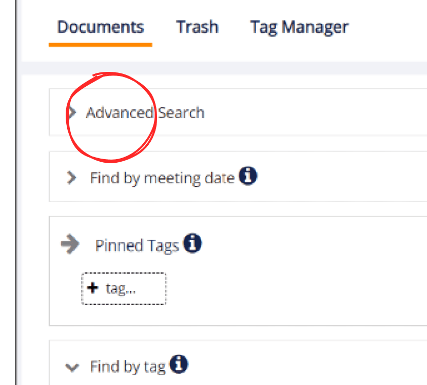
Users couldn’t find search bar, leading to alternatives, such as searching by tags or navigating away from Documents page
Where is the search bar?
This feels fiddly to me...it’s hard to drag with a touchpad
I don’t see any feedback so I’m going to guess it uploaded?
Design Phase
Ideation
My Role
UI Designer
My Deliverables
Crazy 8's Sketching | Low-Fidelity Wireframes | High-Fidelity Screens | Interactive Prototype
Next, the team moved into ideation to start bringing our ideas to life.
I participated in rounds of Crazy 8's sketching. We then compared sketches, discussed commonalities and questions, and adjourned to independently work on wireframes.
We each made a version of our wireframes, then pitched them to the client and the developer. Based on their feedback, we coalesced our wireframes into one version and continued to build them into a higher-fidelity model.
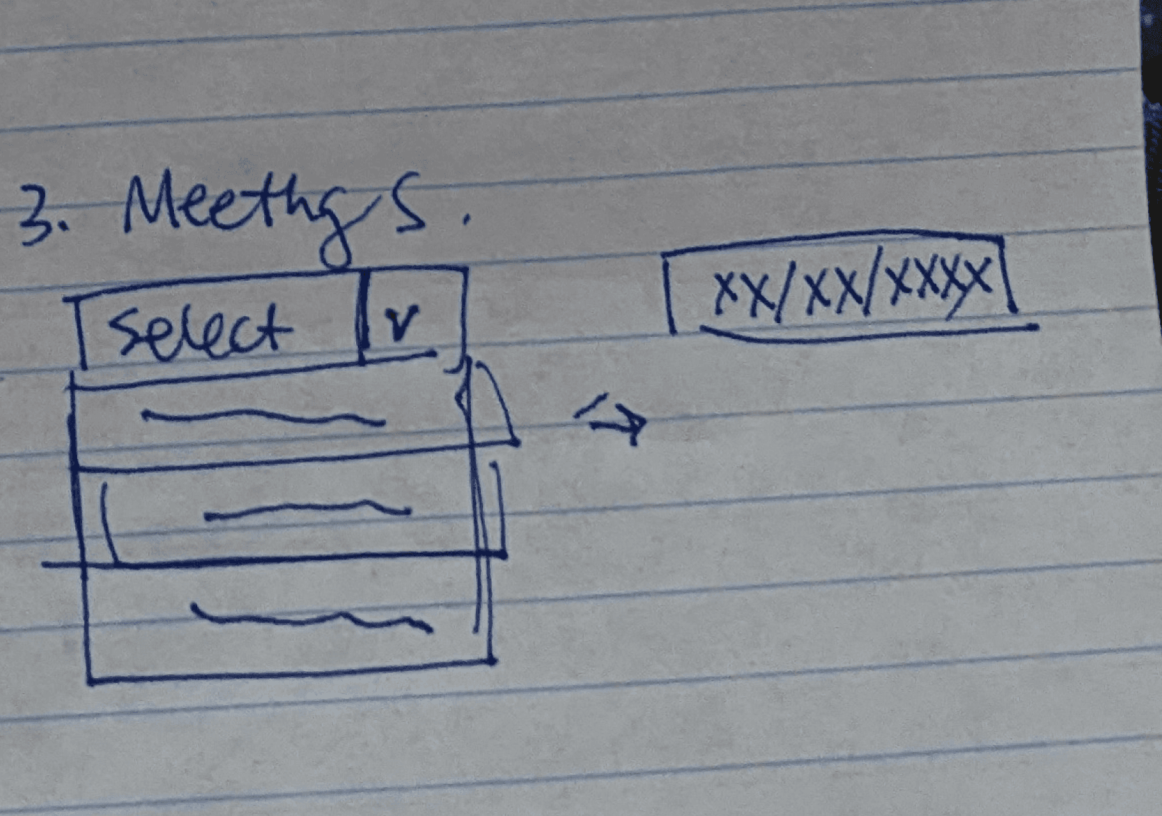
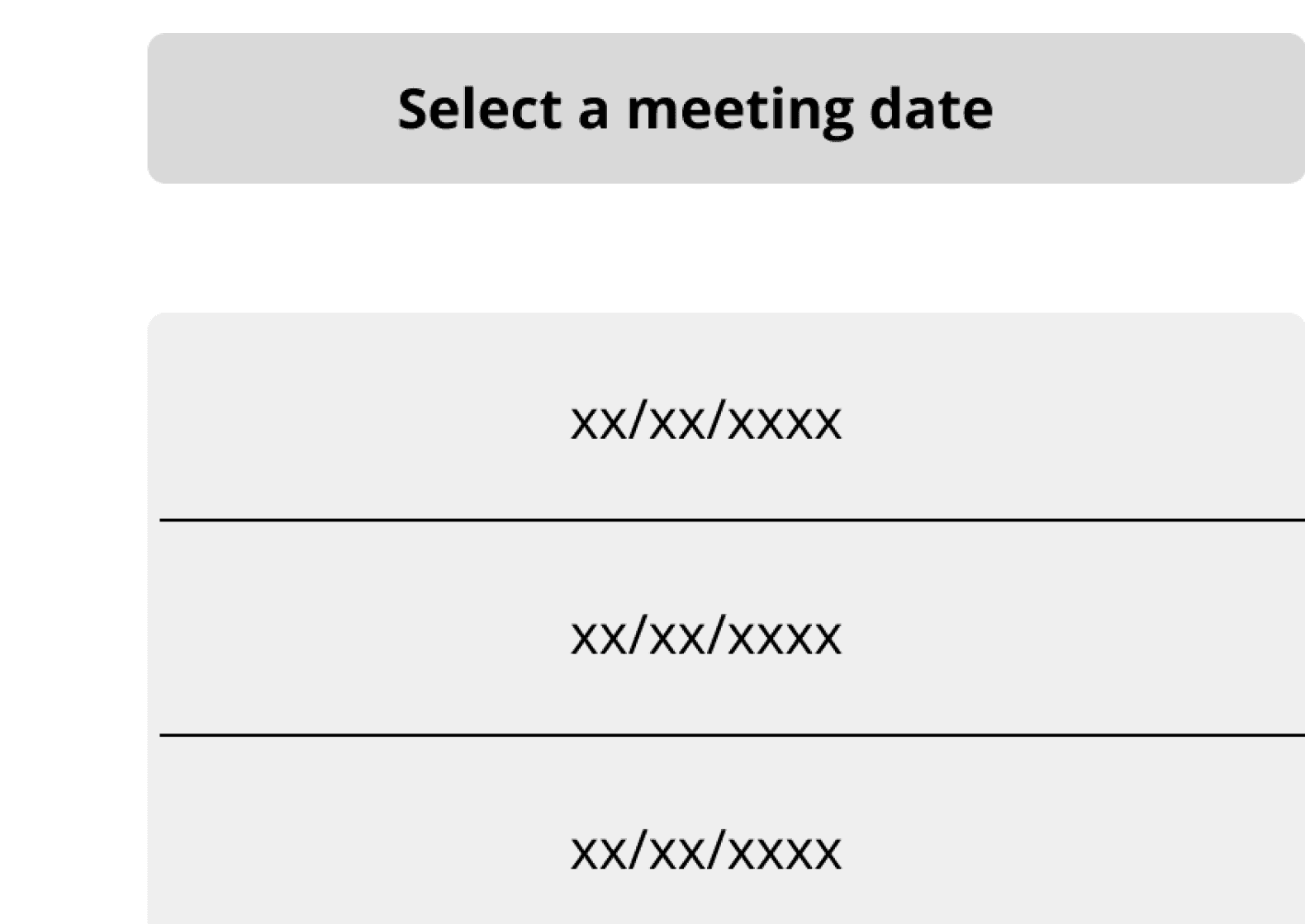
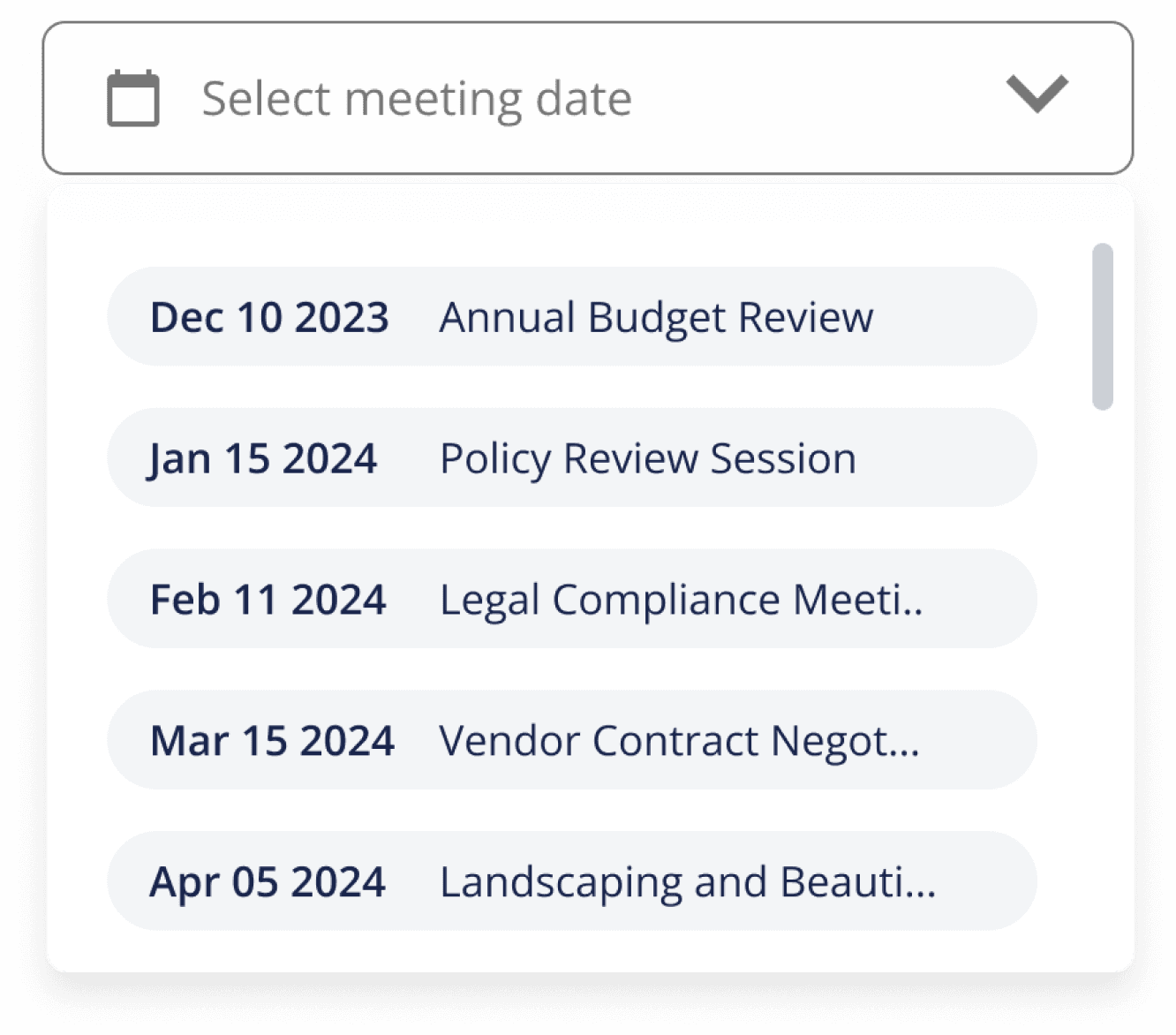
Linking Meetings wireflow: my evolution from sketching, low-fidelity screen, to high-fidelity screen
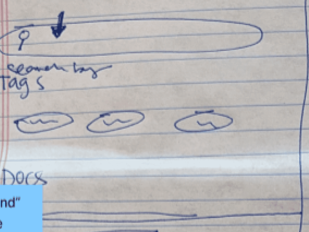
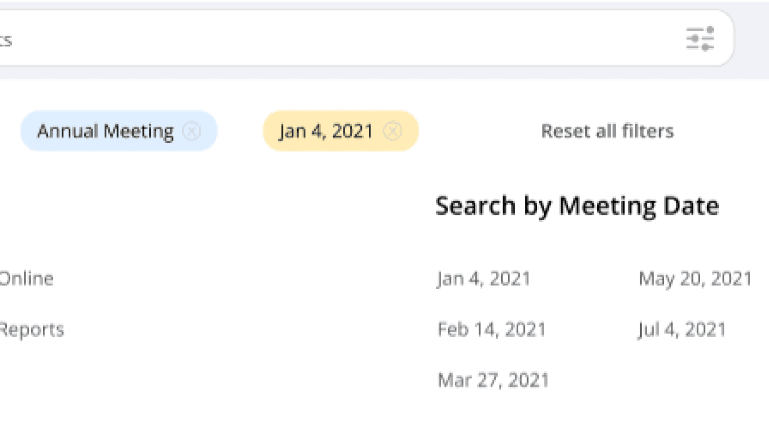
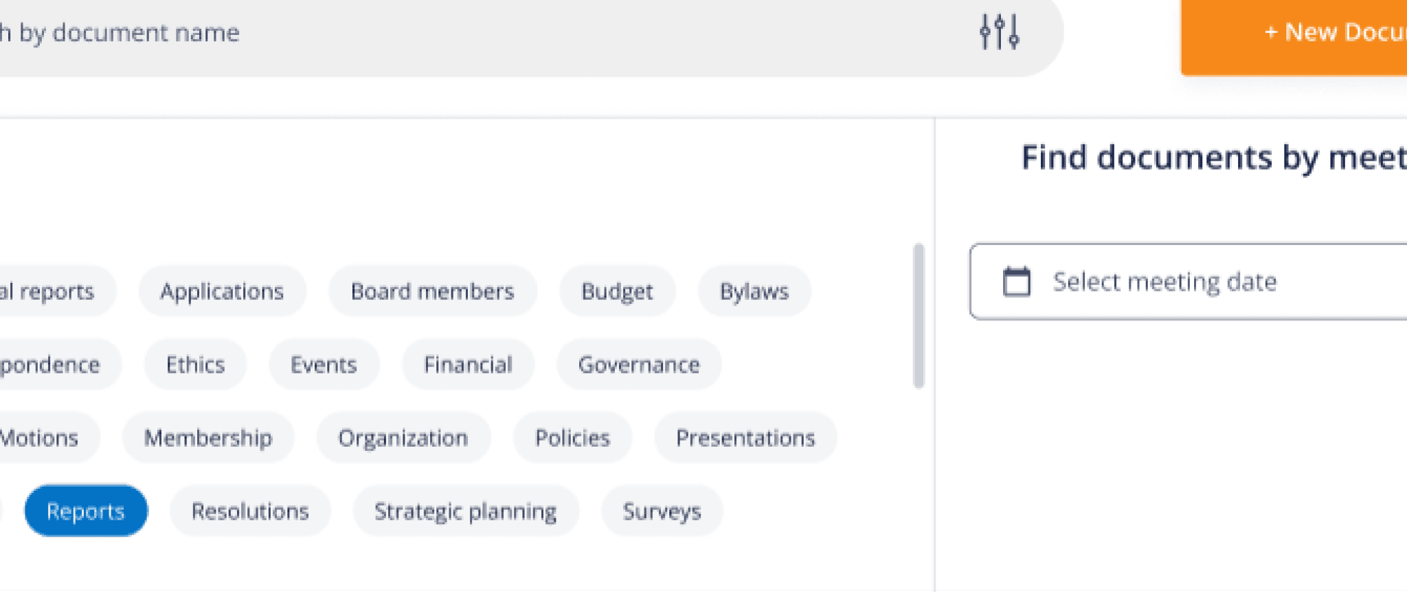
Search Documents wireflow: my evolution from sketching, low-fidelity screen, to high-fidelity screen
Solutions Broken Down by User Flows
1
Uploading new documents
Before
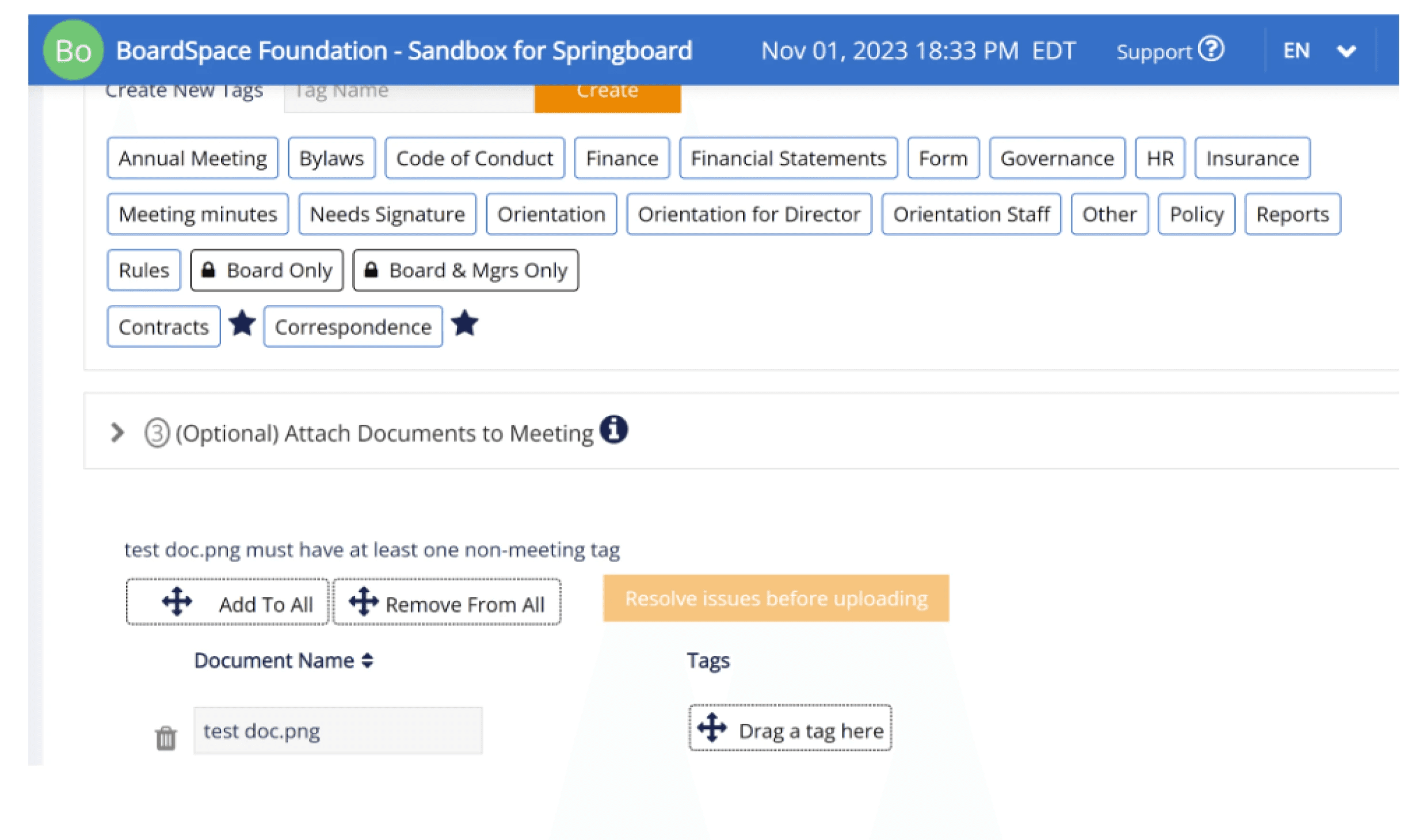
Add Documents
Frustrations
Couldn’t see the Upload button at the last step, prompting users to exit the process without successfully uploading the document
Attaching a tag required dragging motion, which was not intuitive and required more dexterity than clicking
Lacked user feedback after each required step, leaving users frustrated that nothing was happening
After
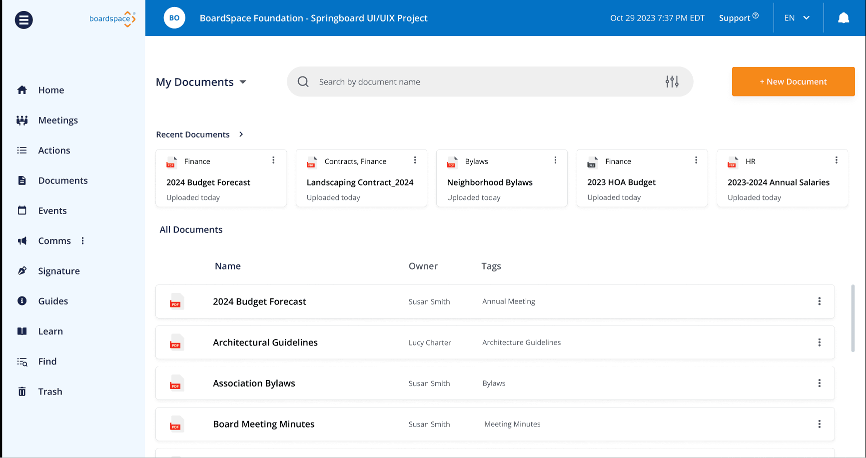
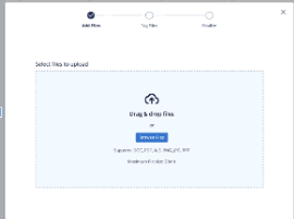
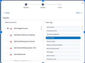
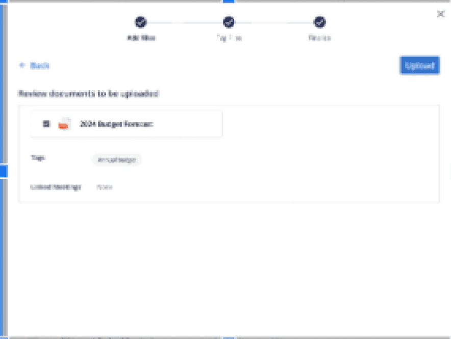
Solutions
Moved upload steps into a pop-up, separating necessary actions (select file, attach tag, clicking upload button) to one action per screen
Changed attaching tag action from dragging to clicking
2
Linking meetings to documents
Before
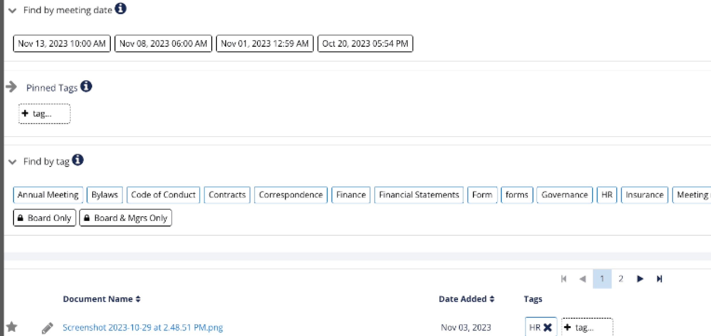
Frustrations
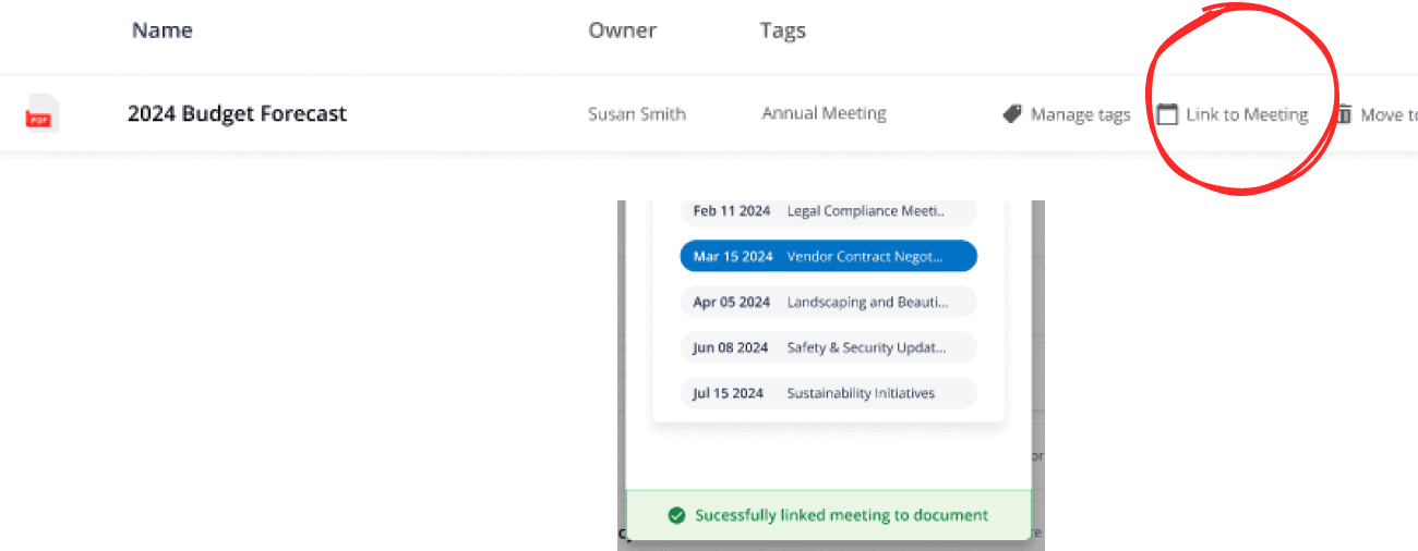
Dragging action was cumbersome, required accuracy and dexterity, and frustrated users by requiring multiple attempts
Lacked user feedback to indicate tags were successfully added
After
Solutions
Switched to clicking action
Created a hover menu that shows up on each document file; once clicked, it opens a drop-down menu
Once meeting is selected, a green indicator bar appears to indicate successful action
3
Managing tags
Before
Frustrations
No user feedback informing tag creation was successful
Tag manager tab wasn’t obvious
Attaching tags to files required dragging, which users didn’t like
After
Solutions
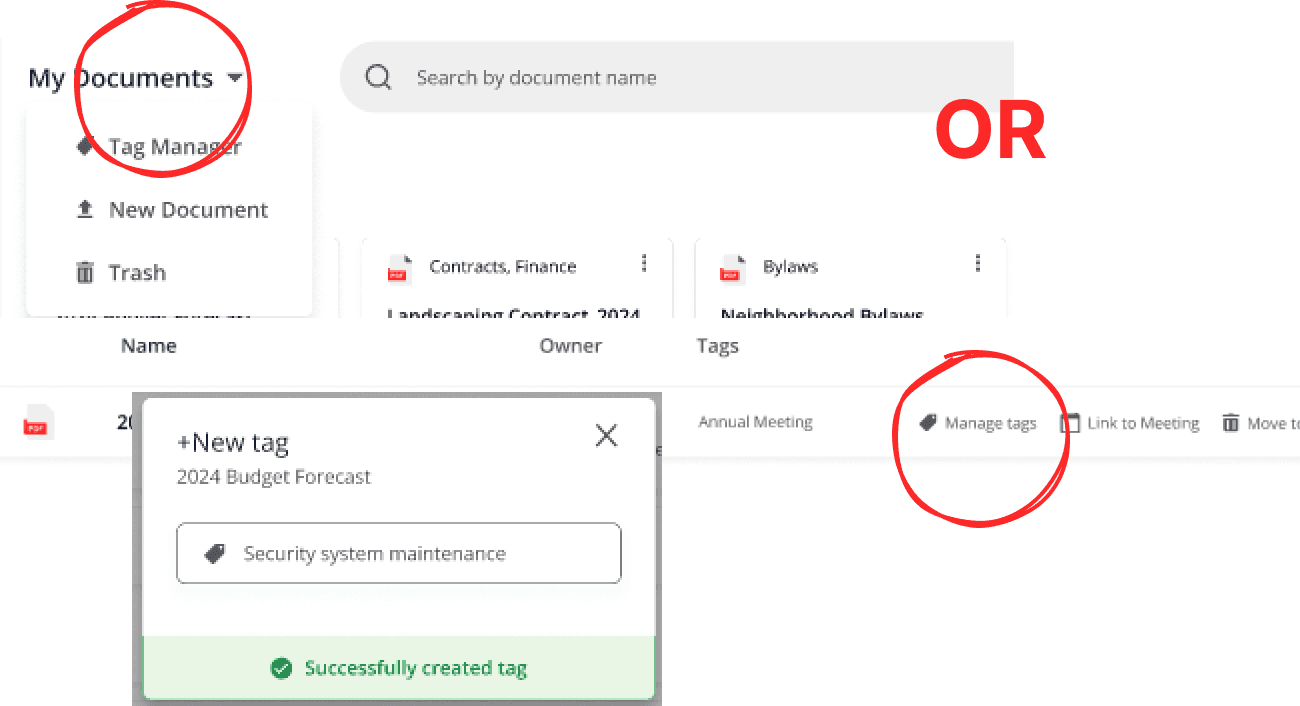
Upon hovering over files, “Manage tag” button can be clicked to bring up a pop-up overlay
Upon selecting tag, a green bar indicator pops up to inform user of successful action
Changed the Tab Manager access to a drop-down menu instead of a tab format
4
Searching for documents
Before
Frustrations
Search bar wasn’t displayed clearly and wasn’t obvious where it was located
After
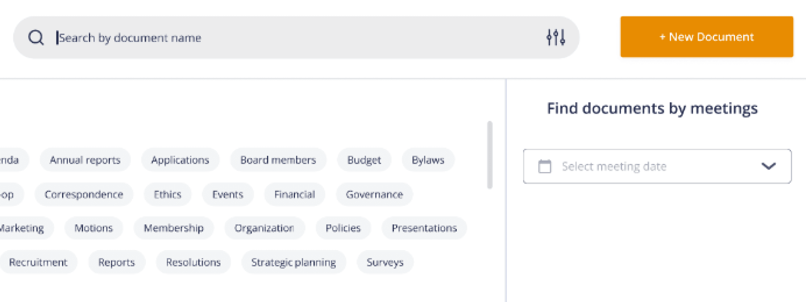
Solutions
New layout has a big ole’ search bar right up at the top of the screen
Clicking the search bar or filters icon brings up tag and meeting search options
Validation Phase
Usability Test #2
My Role
UX Researcher

My Deliverables
Two usability tests | Data Analysis | Surveys
There were two major differences between this round and the previous round of usability testing.
One was the design version that was being tested - in Test #1, the baseline designs were being tested. in this test, our new designs were the ones being tested.
The other difference was that instead of using new participants to Boardspace, we tested with existing the company's existing users (I go more into detail the reasons of testing this way in the final section of the case study). While doing it this way made it more difficult to find direct correlations caused by the re-design, we still had useful findings come from this test, and we got to hear the feedback of actual users.
We also asked participants to fill out a short survey rating their subjective experience with Boardspace's current design and trying our prototype.
Results
1
2
3
4
Uploading new documents: 63% —> 88%
CTA discoverability improved
Executing tag attachment improved
Subjective feedback was that the new design took more clicks and took longer
Linking documents to meetings: 50% —> 100%
Action discoverability and successful execution both improved
Managing tags 87% —> 82%
Success of creating tags dropped from 100% —> 70%
Attaching existing tags to documents remained the same at 100%
Search for documents 50 —> 88%
Search bar discoverability increased from 0% —> 100%
Search by filters remained unchanged at 75% success
Discussion
Recommendations
Based on the test findings, we recommended that the client implement the new designs that showed significant advantage over the baseline designs. For the designs that showed promise but had still unanswered frustrations, we recommended continued development. Additionally, I recommended some problem spaces for future projects that felt important to investigate but fell outside of this project's scope.
For the Documents Tab
Use new layout for improved: Search and upload CTA’s, aesthetic appeal, visual prioritization of document files
Implement tagging and linking meetings flow for increased success
Make edits to the Tag Manager for more discoverability - i.e change colors, increased icon size
Incorporate pop-up screens for Upload Experience but continue to develop and test idea to minimize clicks and simplify process
From a holistic perspecive
Prioritize establishing a product style guide for consistency across all pages
Prioritize a site-wide usability analysis to prioritize solving for the most critical pain points
Run heuristic analysis and UI check to identify inconsistent designs issues with minimal resource requirements
Consider what role AI can play in Boardspace to keep competitive and up-to-date, such as auto-tagging and automated meeting notes
Challenges
The biggest challenge I faced was the tight timeline because it had a trickle-down effect that caused a few other challenges.
I knew that time was not on our side, and I felt pressure to jump into action as soon as the large picture planning of the project was done. I wasn’t really sure who I wanted to test in Round 2 - new users like Test 1, or the current users of Boardspace? At the time, I only considered the benefit of testing with the current users. Feedback from new users guided the re-design, meaning that the re-design should give them an improved experience. If I could prove that it was usable by current users, then the re-design could help everyone.
However, should is a big assumption, one that a researcher should not make if they can help it. “Test, don’t guess,” a scientist friend always says to me. And that became apparent when it came time to compare both tests. We proved that the re-design is usable with current users, but I can only guess and hope that we would be helping new users as well. Ideally, we should have consistently tested only new users in both instances, or now that we've evaluated the redesign with current users, it would be beneficial to perform a third round of testing specifically with new users to gather direct A/B data. However, we then return to the issue of not having enough time to do more testing. Alas.
Takeaway Lessons
Careful planning usually is worth the extra time cost
A/B Testing should be ideally performed without changing any other variable than the design that’s being evaluated
Even when tests aren't perfect, we can actively extract valuable data and use it to derive meaningful insights
Having good teammates makes all the difference in work enjoyment. Logan and Kristin were responsible and hard-working, and they brought their A-game to every meeting and every assignment. I cannot say enough good things about working with them, and the work we delivered to our happy client is a testament of our stellar collaboration.